For this preliminary exercise, I worked with Rayelle and Daniel to tell the story of a kidnapping. Our planning process was somewhat confused as we had got the wrong impression that the video was meant to be three minutes long rather than thirty seconds so we had planned a three minute video which we then had to cut down, but that wasn't too difficult. We split the planning tasks between the three of us and this was an effective way of getting the planning done efficiently so we were ready to film with a clear plan and no confusion on Friday. This made the filming process a lot easier and even gave us some time to start editing it. In terms of the actual video there were elements to it that were good and elements that could have been better. One of the good things about it I think was the camerawork, specifically the handheld shot at 0:35 and the slow movement of the camera from the shot at 0:50 to 0:58. I think these two moments in the video add to the realism and tension and as a result the audience become more immersed in the action happening on screen. Another good element to this video I think were the match on action shots we used because these made the video 'flow' better and made it look a lot neater. However, there were things that we could have done better. For example although we followed the 180 degrees rule, our over the shoulder shots could have been made to look more realistic so one way we could do this in the future is by having the two actors sit closer together - this way it would increase the realism of the idea that a conversation is being held. Something else to help with this would be to position the camera much closer to the shoulder/neck of the person in front of it to decrease the amount of empty space in the shot to ensure the audience's attention is solely on the characters and their interaction with each other. One of the biggest issues we had during filming was that we found it hard to focus on the important objects, particularly smaller ones like the purse so the focus ended up on things like the radiator. I think the reason behind this was that we didn't get to grips with the lens we were using and I think we possibly used the less useful one of the two we could have chosen from in terms of filming close up shots. If we were to do this again I think we would need to spend more time getting the accuracy of our shots right rather than dedicating most of our time to the content.
Thursday 1 December 2016
Sunday 20 November 2016
Boyz n The Hood review
Boyz n The Hood is a coming of age crime drama that focuses on the teenage lives of Tre and his friends Doughboy, Ricky and Chris in the early 1990s.
Having been involved in fighting at school, Tre's mum takes him to live with his dad in a South Los Angeles neighbourhood where he is reunited with his friends. We first get an idea of what this place is like when Tre's dad is involved in a shooting on his first night there; the next day Chris shows the rest of them a dead body to which they react remarkably calmly, as if seeing a dead body is the most normal thing. This immediately tells us that crime is obviously a common issue in this particular area/time period and could be foreshadowing future events.
As the boys become teenagers, they are confronted with many difficulties faced by countless teenagers and they all develop their own personalities and aspirations.
Tre finds himself in a relationship with Brandi who he has had strong feelings for since they first met and she makes him a lot more open minded about having sex, explaining her preference to wait, which he accepts.
Ricky, having come from a single parent family and becoming a young father himself, decides that he wants an education at university to become a professional American Football player so he and Tre sit their SAT exams in the hope that they will be able to go together.
Doughboy appears to have taken a different outlook on life and leads himself down the path of drugs, alcohol and crime, much to the disappointment of Ricky and Tre.
In a neighbourhood with crime around every corner, the boys are presented with new challenges throughout the film, testing their anger, desire and self-restraint to the limit.
Thursday 17 November 2016
Film Language Test: Learner Response
33 = B
WWW: A really strong response throughout with excellent insight and reference to the clip. The challenge now is to move from solid level 3 to level 4.
EBI: You need to bring in some media theory and possibly more on genre too. This is a key aspect for top level answers (narrative theory would work well for this exam)
-Some paragraphs need a little more depth... for example, you could say a lot more about Keaton's expression when he sees the killer.
-For sound, you missed SFX and for editing, eye-line matches. Areas to revise for next time!
LR:
How is editing used to create drama and tension in the opening scene?
The editing of this scene is very successful at creating drama and tension. For example, the pace of the editing is very slow and this type of editing is generally associated with the build up of tension - in this case the audience is left anticipating what is going to happen between the two characters. The shots of the killer standing on the boat and walking down the steps are particularly slow paced which shows that the majority of the tension is coming from this character and his actions which makes the audience aware that he is someone to be feared and we assume that he and Keaton are about to encounter one another, and the fact that Keaton is already injured and his identity is exposed to the audience which is quite the opposite of the killer (who we already know is up to no good), we could also assume that their confrontation probably isn't going to end well for Keaton.
As the killer approaches Keaton, Keaton looks up at him and usually, we would expect (as the audience) to see an eyeline match from Keaton to the killer but in order to create tension, the director appears to have made a conscious decision to hide the killer's identity from us which then leaves us wondering who the killer is throughout the rest of the clip. The camera continues to cut to other shots during the scene, but there is never an eyeline match from Keaton to his killer's face. This could be an example of an enigma code created by Barthes which intentionally withholds information from the audience, information that could be crucial to the narrative and its ending (that information in this scene is the killer's identity) This is a very successful way to build tension and retain the audience's attention.
Finally, towards the end of the scene, the killer drops his lit cigarette onto the spilt fuel on the floor, just as Keaton had done with his matches. However, as he drops it, slow motion is used which lengthens the build up to the final explosion for which slow motion is also used. This could add to the strong emotional impact felt by the audience about Keaton's death and also adds to the dramatic atmosphere. In terms of other aspects of film language, the emotion of the scene is heightened by the crescendo in the music which happens at the same time as the explosion and this enables the audience to feel resentment towards Keaton's killer which makes us all the more desperate to discover who he is.
Preliminary Task - Shot List
Shot:
1) Medium long shot from behind Subs as she's walking home.
2) close up shot of side of Subs' head showing she's listening to music.
3) Over the shoulder shot as she approaches the boys.
4) close up shot of wallet falling to the floor.
5) Eyeline match from Subs to the wallet.
6) Long shot of Subs picking the wallet up and asking the boys if it's theirs.
7) Medium long shot in front of Subs moving back as Subs opens the wallet whilst walking towards the camera.
8) Close up shot of money in the wallet
9) Close up shot of Subs' facial expression.
10) Medium long shot of Subs looking around and putting the wallet in her pocket.
11) Handheld medium shot from behind walking towards Subs - in same shot Maurice puts bag over Subs' head.
12) Fade/cut to black.
13) Medium shot of kidnapper leading Subs to door.
14) Close up match on action shot of kidnapper opening door.
15) Long shot of whole room as kidnapper sits Subs in chair and exits.
16) Medium shot of Subs' face as Carys removes bag. Subs panics.
17) Medium shot of Carys sitting down and calming her down.
18 - 31) Alternating over the shoulder shots between Subs and Carys during their conversation.
32) Medium long shot of the door as the knock is heard.
33) Close up shot of Subs' face with "who's that?"
34) Long shot of room showing Subs and Carys, Maurice walks past camera but only his torso is visible (hiding his identity)
35) Medium long shot from behind Maurice's head as he takes off his hood and delivers his line.
36) Close up shot of Maurice's mouth as he finishes saying his line.
Thursday 3 November 2016
Editing
This is the scene of the song El Tango de Roxanne from the 2001 musical Moulin Rouge. In this scene, we see three scenarios that are happening at the same time as each other and are in some way connected with each other.
The transitions of this scene are all straight cuts which could symbolise the intensity and severity of the relationship between Satine and the Duke. It also makes the scene more engaging for the audience because the cuts are so sudden, especially when the pace quickens so more is happening for the audience to pay attention to. Furthermore, because these cuts are so frequent, the audience hardly notices them so the chronology of each scenario in the song becomes easier to follow because we understand that they are happening simultaneously.
It could be argued that this scene has used continuity editing even though the transitions go from one scenario to another but when it goes back to the scene it started off with, it follows on from the first bit we saw - for example, the three scenarios in the scene are Satine and the Duke's night together in the Duke's mansion, the narcoleptic Argentinian singing and teaching the Tango de Roxanne to the Moulin Rouge dancers, and Christian singing/thinking about how the Duke is going to mistreat Satine.
The first scene shows Christian starting to walk through the Moulin Rouge; the dance then begins and we see Satine and the Duke in his mansion. We then cut back to the dance which has continued from where we last saw it and we then see Christian continue to walk through the club and from then on we continue to see the chronological events of each scenario before eventually Christian has walked out of the Moulin Rouge and ends up underneath the Duke's balcony where the Duke and Satine are now standing together. We then stop seeing the dance for a while, and then it returns when the Duke becomes aggressive with Satine and the sequence of the scenarios continues until the very end of the song.
In terms of other aspects of media language, the sound of the dancers' bodies moving e.g. their feet hitting the floor really emphasises the cuts between the scenes which helps maintain the audience's attention. Also, most of the cuts happen in time with the music which also gives the whole scene more fluidity.
The pace of this clip changes throughout depending on how the narrative progresses. At the beginning of the scene the pace is relatively quick during the tango scenes but slows down slightly each time we return to the Duke and Satine and I think the intention behind this was to build up excitement and intensity during the tango scenes and then to build up tension during the slower paced scenes involving Satine and the Duke, preparing the audience for the climatic events towards the end which a slow paced sequence could foreshadow. The pace then continues to quicken when Christian starts singing and it cuts very quickly through each scenario which could signify his feelings of panic and despair that Satine is supposed to be sleeping with the Duke tonight.
At 2:23 we return to Satine and the Duke and the pace slows down as the Duke begins talking and this change of pace sustains the tension built up between them both and makes the audience wonder what's going to happen as the scene develops. The pace remains slow until 3:07 when the singing resumes which quickens the pace again.
Then, when Christian reaches the Duke's balcony, the pace slows right down again which could highlight the hopelessness Christian and Satine feel that they can't be with each other tonight and that Satine has to spend the night with the Duke. Then, as the Duke's anger grows, we notice the pace begin to quicken again and we know that we are reaching the climax of the scene which leaves the audience fixated, eager to see the result of his rage. As the singing and dancing resumes, with as much ferocity as it left off with, the pace increases to the fastest it has been throughout the whole scene and this reflects how the intensity of each scenario has peaked e.g. the Duke is attempting to rape Satine, Christian is beside himself with despair and the tango has escalated and become much more sensual and dramatic.
There are many moments of juxtaposition in this scene. I think the most noticeable one is probably when Christian is under the balcony and there are numerous eyeline matches between him and Satine, reiterating their love for each other. Furthermore, a lot of the dancing in the tango is naturally very sensual, and these scenes are often followed by Satine and the Duke and the intention behind this could have been to signify that the relationship between Satine and the Duke is purely sexual and the intensity of some of the dancing could be a way of foreshadowing the aggression the Duke takes out on Satine.
Saturday 15 October 2016
Cinematography - Pride and Prejudice
This is the opening scene to Joe Wright's 2005 adaptation of Jane Austen's novel Pride and Prejudice. The first shot of the whole film is an establishing shot, introducing us to the setting, which we see is the countryside. This shot continues for about 45 seconds while the first credits are shown.
The next shot is a medium shot of the film's protagonist, Elizabeth Bennet and she is walking towards the camera reading a book; the camera moves backwards as she walks forwards and zooms out slightly to show us her surroundings and we immediately have an initial idea as to her character/personality. This is reinforced by the next shot which is an over-the-shoulder shot in which we see the book in more detail - as she closes the book, she appears to stroke it which could be an indicator of her passion for reading so we are able to infer that her character is one of creativity and imagination.
The next shot is another establishing shot which introduces us to the Bennet residence which appears to be a farm, possibly indicating the family's wealth and social class.
The next shot is a medium-long tracking shot of Elizabeth, following her as she walks through the hanging linen towards her house. As she walks past the door of the house, the camera stops following her and we are taken into the house.
In this single shot that lasts over a minute, we are quickly introduced to the rest of the family and this gives us brief insight into their characters.
The camera then stops moving forward and slowly pans to the right so we are given a further understanding of the family's home life.
Then, the camera stops panning and continues to move forward and takes us outside onto the veranda and we are re-joined by Elizabeth who comes up onto the veranda and looks into the window in front of her as she hears her mother's voice and the camera stops just behind her, creating another over-the-shoulder shot enabling us to see what Elizabeth can see which could signify that what is happening in the window provides information relevant to the rest of the narrative.
The camera then moves backwards creating a long shot and continues to track Elizabeth, highlighting her significance, making it very clear that she is the protagonist.
The next shot is a medium long shot of Elizabeth's two youngest sisters, Kitty and Lydia eavesdropping outside the room their parents are in and this illustrates their childishness. Elizabeth initially tells them off but then in the next shot which is a medium close-up shot she joins them, suggesting that she too has a childish side to her. They are then joined by their oldest sister Jane and the remainder of the scene alternates between the medium close-up shot of the four sisters, and the medium long shot of Mrs Bennet through the ajar door which reinforces the idea of the importance of the conversation being had between Mr and Mrs Bennet.
Monday 10 October 2016
Blog Feedback
WWW: What a fantastic start to AS Media – I thoroughly
enjoyed reading your blog and what comes through so strongly is how much
knowledge and passion you have for film. I can’t tell you how valuable this is
when studying A Level Media! You’ve picked out some superb clips and images to
study but what really sets your work apart is the analysis. You are confidently
using media terminology while deconstructing texts and images. This in-depth
textual analysis is extremely positive and coupled with your natural authority
on film tells me you should be aiming for the very highest grade in this
subject. Keep up the good work!
EBI: There are a couple of minor things that we can fix
straight away: in terms of how you present and organise your writing, please
left-align all work as you would expect if using Microsoft Word. Similarly, you
also need to look at paragraphing: for the Little Miss Sunshine clip you pick
out so many excellent aspects but in one large block of text it’s difficult to
follow. It’s also useful to divide each aspect you are analysing into separate
paragraphs as you can then self-assess whether you are discussing each point in
sufficient detail and really considering the impact on the audience. Finally, a
couple of other comments – the sound video LR doesn’t contain an assessment of
your top three sound videos from the class and why and your film noir research
is very short. This surprises me – in a blog full of phenomenal film knowledge
and expertise this post really stands out as lacking depth!
LR: Reflect on your first month of Film Language. What is
your strongest piece of work so far? What is your weakest? What specific skills
or knowledge do you need to develop over the rest of the course?
Sound Clips Analysis
A Clockwork Orange
As soon as the clip begins, we hear a dramatic piece of what initially appears to be non diegetic classical music in the background but then a voice-over begins and we can assume it's Alex, the character leading the group in the clip and during his voice-over he mentions how he can hear a piece of music from a stereo in someone's window, leading us to wonder whether the piece of music we can hear is diegetic or not. I think this particular piece of music becomes more and more contrapuntal the further we get into the clip and not the kind of music you would expect to hear for such a violent scene. I think Stanley Kubrick chose to use this piece of music because it accentuates Alex's insanity in that the music has connotations of triumph and and optimism so it implies that Alex feels triumphant about the fact that he is afflicting injury on his "Droogs". Furthermore, the fact that we can't hear the violence; all we can hear is the music suggests that this was Stanley Kubrick's way of essentially softening the scene and making it easier for the audience to handle, whereas if we were to hear the violence, especially the first thing Alex does, I think a large proportion of the audience would have found it extremely hard to watch, especially since it's in slow motion. Also, when the violence starts, the volume of the music increases which heightens the dramatic nature of the scene, drawing the audience's attention to the action.
Once Upon A Time In The West
During this scene, all the sounds we hear are diegetic and they are all sounds that emphasise how desolate and empty the characters' surroundings are. For example, we hear sounds like knuckle cracking, water dripping, footsteps, a fly buzzing and a windmill creaking. All these sounds have deliberately been intensified and they are sounds that would otherwise go unnoticed, yet they are the only sounds we hear and I think the director's intention behind this was to express how barren and quiet the setting is. The collection of sounds appear to build up as the scene progresses and eventually there are many noises happening at once and this builds tension as the audience would naturally expect a climax from all the noise building up, so then we feel relief when one of the men disconnects the tape recorder and all the sounds appear to stop.
There are a number of sound bridges in this clip; the most noticeable one is probably right at the end when we hear the sound of the train approaching but we are still looking at the man with the fly trapped in his gun. The sound of the train might not be immediately recognised as a train and so the effect this has on the audience is that they begin to wonder what the sound is, and then they are shocked by the sudden image of the train going over the camera. The sound of the train is then massively intensified and is very loud and so a strong contrast is created between that and the quiet, calm scenes beforehand, potentially making the audience jump.
Once Upon A Time In America
There are many sounds that feature in this clip, both diegetic and non-diegetic. Examples of diegetic sounds include: the quiet background music at the beginning that appears to be playing outside the house, the rustling of newspaper, the voice of the man giving soup to the injured man, the fire, the fire hoses, the panicked voices of people, the clipping of the name tags on the dead men, the music during the men's funerals, a man making at telephone call. The continuous sound of a phone ringing is also diegetic but not until right at the end and there are times in which we think it applies to different parts of the narrative. Initially we think it is a phone ringing in the house the injured man is in but no one appears to answer it so we know it's not there. Then we think it could be a phone ringing in the scene of the fire but then it moves on to the funeral scene, then it moves onto the image of a phone and so we are certain that it's this phone that's ringing but then when the man picks it up, the sound continues so we are even more confused. Then we see an image of another phone which is the phone ringing so this is a diegetic sound because whoever else is in the room would be able to hear it, but no one picks it up so from this we are able to deduce that it's the phone of the injured man.
Sunday 9 October 2016
My Sound Video Learner Response
Teacher Feedback:
- Great choice of music - has a strong feel and atmosphere.
- Use of YouTube footage is contemporary and interesting and also creates a link between the parallel and contrapuntal.
- Perhaps not enough of a jump/distinction between them despite the clear emotional difference.
- More of a montage/wider selection of clips (perhaps newspaper/online headlines relating to the issue?) could have added to this.
My own Feedback:
WWW:
-I think my choice of music was a good choice and I think it worked as both a parallel piece and a contrapuntal piece.
-I think my clips contrasted well in terms of mood and emotions.
-Both clips and the lyrics of the song link to current issues faced by many girls around the world.
EBI:
-Adding a newspaper or online headline would have made it better in terms of getting the message across.
- I should have used more clips and perhaps some still images to shorten my original clips and decrease the risk of the audience losing interest.
-Using two very similar YouTubers lacked variety - I could have used one clip from a YouTuber and one clip from a film or something similar to make the video more interesting and appealing to more than one audience.
My Top 3 videos in the class:
Ratna:
I enjoyed Ratna's video because there was a clear contrast between the parallel and contrapuntal clips and the contrapuntal clips were completely contrapuntal to the music and so as well as working extremely well, there was also a sense of humour to it. However I think the use of titles lessened the impact of the change from parallel to contrapuntal on the audience.
Ellis:
Ellis' video also showed a clear contrast between the two sets of clips and the music worked with both in that it was definitely parallel with the images of mountains and the complete opposite of the images of war and fighting so the transition from one to the other was a shock to the audience and the contrast between the music and the contrapuntal clips had an almost eerie feel to it. I think that he could have used some video clips as well as still images.
Karol:
I liked Karol's video because of how contrapuntal the classical music was to the second clip - the contrast was so strong that it made it funny to watch, especially the subtitles and this kept the audience's attention throughout. Similarly to Ratna's the titles lessened the potential shock the audience could have felt about the transition from parallel to contrapuntal.
-
Film Noir
Film Noir is a film genre that was extremely common and frequently used in the 1950s, with sub-genres of crime, mystery, drama and often romance.
Getting the lighting right in Film Noir is crucial because it is usually the lighting that enables audiences to identify a film as being of the Film Noir genre. For example, Film Noir directors usually incorporate the frequent use of extreme contrast between black and white, also known as Chiaroscuro. This creates a strong sense of mystery and tension, themes that often feature in Film Noir. Another vital element of any Film Noir film is the use of shadows to reinforce the mysterious narratives. Shadows can be created by using under-lighting and back lighting, and putting filler lights at different angles can create a variety of shadows. Examples of films that incorporate the Film Noir genre include: The Maltese Falcon, The Blue Dahlia, The Big Sleep and some could argue that there are elements of Film Noir in some Hitchcock films like Psycho, although the overall genre for Psycho isn't Film Noir so wouldn't immediately come under that category.
This is the theatrical trailer for the 1941 film The Maltese Falcon. This trailer tells us that the genre is Film Noir because it hints at all the different sub-genres that are to feature in the film with on-screen text, the most obvious ones being crime and romance, which are both extremely common in Film Noir films. The trailer also includes a brief scene involving shadows which ultimately confirms that this film is of the Film Noir genre, since shadows are an essential feature of the genre, as well as the contrast between black and white.
Film Language: Lighting

The lighting in this photo could arguably be either high-key or low-key but since the whole of the woman's face is visible, this suggests that it uses high-key lighting. I think position of the lighting used is a combination of top and back lighting as it appears to be coming from the side, perhaps a window and this is in order to emphasise both her face and the smoke. The fact that the smoke has been deliberately exposed by the lighting creates a mysterious feel to the image, indicating that the woman could be concealing something that the audience isn't meant to see, suggesting that this film's genre could definitely be Film Noir.
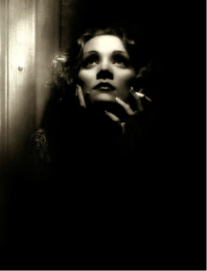
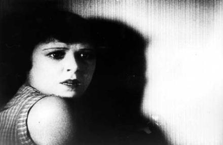
The lighting in this photo is undoubtedly low-key lighting since the only thing we can see in it is the woman's face. The director's intentions behind creating this darkly lit image could have been in order to emphasise the mysterious narrative that the film appears to have. The lighting that exposes her face is clearly top lighting and the fact that only her face is lit tells us that that is the part that requires the audience's attention; it's the most important part of the scene. The lack of lighting in this scene creates a feeling of being trapped, as the woman in this photo also seems to be and so it enables the audience to be as involved and engrossed in the film as possible, empathising with the woman.

The lighting in this photo is definitely high-key lighting because every aspect of the photo is well lit, except a small number of places under the man's chin and eyes, which emphasises the rest of his face more, making him look dominant, important and powerful. The lighting appears to be coming from all angles which reinforces the idea of him being a powerful and important character, drawing the audience's attention directly to him. Referring back to the shadows around his eyes, as well as making us think he is important, they also create a sense of darkness in this well-lit photo, causing us as the audience to wonder whether he is perhaps dangerous as well as powerful.
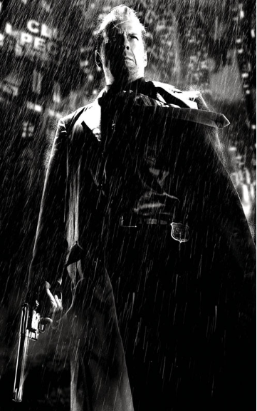
The lighting in this photo could be both low-key lighting and high-key lighting based on the fact that not everything in it is clearly lit but there are some areas that are very well-lit. I think lighting that has been used is top lighting that accentuates only the top half of his body and possibly a filler light from the left side of the character which lights his face very clearly. This back lighting has been used to create some sort of silhouette of the character which makes him look mysterious and almost scary. The fact that they have only lit one side of his face reinforces the idea of him looking scary and threatening - the gun he's holding also appears to have a 'glow' to it in a very dark part of the image, drawing our attention to it and this makes the audience aware that he is probably unafraid of violence, subsequently making us even more wary of him.
The lighting in this photo is interesting because every part of the woman in it is brightly lit, but there are still shadows of her on the wall. However, I personally think that this is high-key lighting because there aren't any parts of her body that have been obscured due to the lighting. The lighting used here appears to come from all angles, completely exposing her, which perhaps links with the film's narrative. However, as well-lit as it is, the use of shadows could be emphasising the mystery and the elements of Film Noir that this film could include, enabling us to make deductions as to the genre and the narrative.
This photo's lighting is difficult to define because there are elements of both high-key and low-key lighting in it. I think however that it is mainly high-key lighting because although there are shadows suggesting low-key lighting, everything important in the photo is well-lit and the light is coming from most angles, ensuring both characters are lit so the audience can see the action clearly, from which we can then assume that this could a romantic film with elements of mystery signified by the use of shadows.
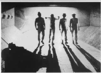
The lighting in this photo from 'A Clockwork Orange' is definitely low-key lighting to create a mysteriously sinister feel. Back-lighting has been used to create a silhouette and long shadows of the 4 main characters in order to conceal their appearances/identities from the audience, creating an extreme sense of mystery and uncertainty making the audience feel wary of them and perhaps threatened by them. We can also see the silhouette of a person lying on the floor in front of them which leads the audience to wonder why he's there and what they're going to do when they reach him.
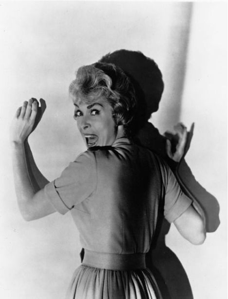
This photo has elements of both low-key lighting and high-key lighting but I think overall it is low-key because of the amount of shadow in it. This shadow creates a strong sense of mystery, especially since half her face is lit and half is in shadow and along with the expression on her face and her body language, the audience might also be able to sense a lot of fear in it which can then lead us to assume that the genre could easily be horror or thriller. There's de

The lighting in this photo is high-key lighting because everything in the photo is completely lit, even though the woman's neck is in shadow, it's still visible. The lighting used is top lighting which has been used to accentuate her facial features and this makes her look slightly exposed and maybe even a bit vulnerable. The small use of shadows on her neck and her hand could maybe imply a sense of mystery or secrecy in the narrative.
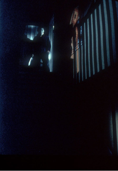
The lighting in this photo is definitely low-key lighting because you can hardly see anything in it and the only place any light is visible is behind the door the person at the top of the stairs has come through and so he has been lit up by the back light behind him, creating a silhouette. This immediately makes us fear him and wonder how the narrative is going to develop with this character. The lack of lighting is a typical indicator of horror films, and this scary looking figure adds to that even more so we can definitely assume that this is from a horror film.
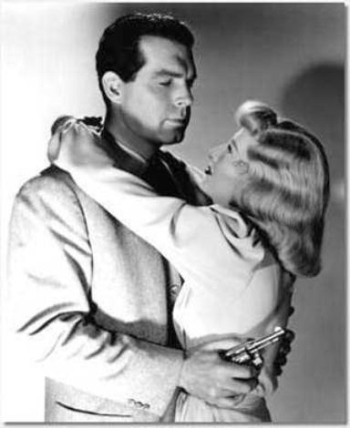
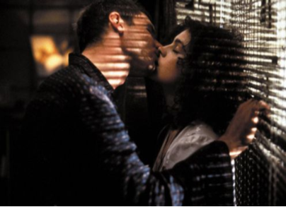
The lighting in this photo, despite the shadows is high-key lighting and the key light is being shone right at the two characters. I think top lighting has been used in order to draw the audience's attention to the two characters and to create realism. However, since the top light accentuates the man's facial expression, we can see he is not smiling like the woman appears to be and we can also see his shadow on the wall created by a filler light and I think this is to symbolise that this particular character isn't as nice and romantic as his wife/lover thinks he is and that he has a nasty, dark side to him and this could be a subtle hint at what might happen later in the narrative.
Saturday 8 October 2016
Film Poster Analysis
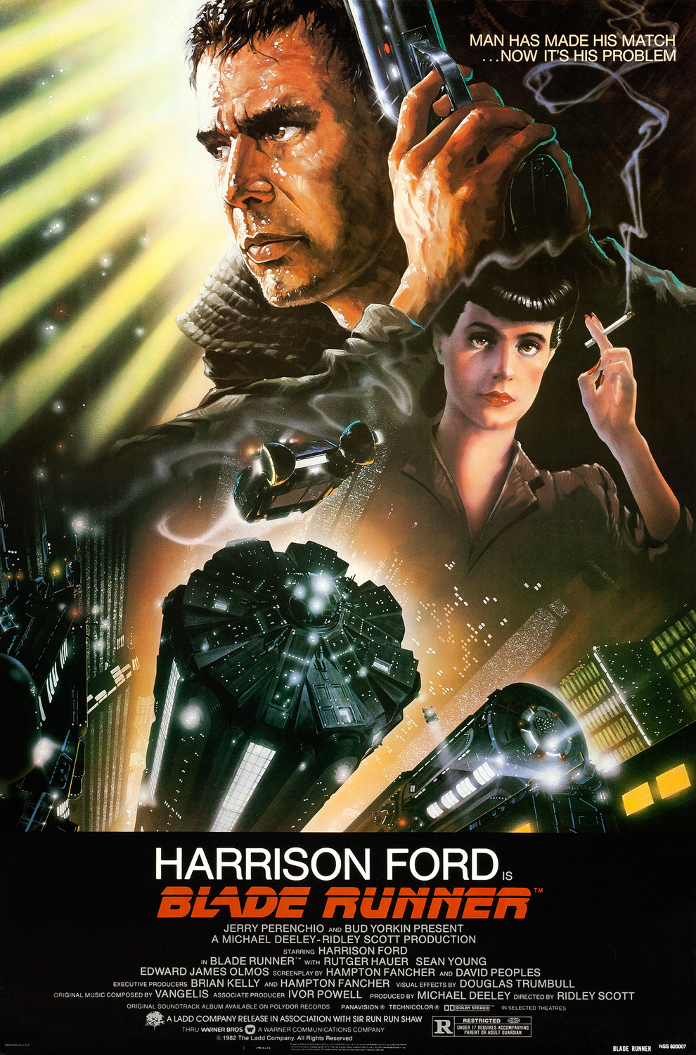 |
| This is the film poster for Blade Runner starring Harrison Ford. One of the main aspects of this film poster that suggests its story line is the image of the gun which could imply that the story line will feature a fair amount of action/violence. The slogan in the top right corner says "Man has made his match...now it is his problem" and this could be a strong indicator that after trying to do something right or successful, the protagonist is now facing problems that have stemmed from his well-meant actions and is now having to fight them which suggests a main plot for the film. The genre implied by this film poster is predominantly Sci Fi, due to the futuristic looking buildings and vehicles featured on the poster and the large amount of bright lights coming from each building. The colour scheme of black, orange and yellow also suggests the Sci Fi genre. However, the image of the woman holding a cigarette in a particularly dark part of the poster could be a subtle hint at a sub genre in the film, possibly Film Noir, a genre that typically includes dark lighting, cigarette smoke and women in its films. I think the target audience for this film would be an older (18-40), more educated audience with a strong interest in Sci Fi films and I think the gender divide would be 70% male and 30% female. |
 |
| This is the film poster for Scary Movie 2. Someone with knowledge of horror films would be able to recognise the image of the girl and the priest in the top left corner from the 1973 film The Exorcist and would also be able to recognise the slogan on the t-shirt of the bottom right girl as being from the 1999 film The Sixth Sense and so would therefore be able to deduce that this film is parodying a number of already existing horror films in its narrative. The genre therefore of a film like this would be a spoof film, combining horror with comedy. I think the target audience of this film would be of the age range 15-30, and would be more or less equal in terms of gender. I think it would appeal strongly to students and also possibly slightly less educated people. |
 |
This is the film poster for Sin City. At first glance, seeing the number of weapons in the poster definitely implies that a large portion of the narrative will feature violence and this could even be implied by the title itself. A possible story line to go along with the violence could be that one or more of the characters is seeking revenge. An obvious genre that this poster connotes is thriller, and this is suggested by the colour scheme of black, white and red, (red is a colour that could be typically associated with anger or death or blood) and the serious expressions on the characters' faces. However I think that the smaller image of a person facing the camera could indicate a sub-genre of mystery, especially since the person's face is unidentifiable. I think the gender balance of this film's target audience is definitely more male than female because the poster itself appears stereotypically 'masculine', especially the colour scheme and the fact that the central character is male, as are two of the other characters featured on the poster. I think that the three guns (suggesting violence) and the title could imply that the age range of the audience this film is aimed at would be around 18-30, predominantly people who enjoy thriller films, or films that feature violence and mystery. This is the film poster for Pirates of the Caribbean: Dead Man's Chest, the second film in the Pirates of the Caribbean franchise. The dominant colour in this poster is green and this, with the image of a large tentacle protruding from underneath the ship could connote monsters and this could be an indication of something that will happen in the narrative. The expressions on the main characters' faces allows us to rule out comedy as a genre and the images of the ships on a rough sea could suggest that the main genre is action/adventure and the tentacle could possibly suggest fantasy. The fact that one of the main characters of an action/adventure film is a woman in historical costume could possibly be a hint that there also may be a sub-genre of romance between herself and another main character since at first glance she doesn't visually fit the description of an action/adventure film so you begin to wonder where in the film she fits as a main character. Looking at Johnny Depp's character, his bandana is bright red and is a huge contrast to the other colours in the poster so it stands out. He is also holding a gun and is the only one doing so. These two things could signify to the audience that he is the protagonist. I think that based on this poster, the target audience of this film would fit the age range of 13-25 and I think the gender divide would be about 60% male, 40% female. 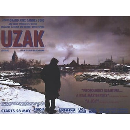 This is the film poster for Uzak, a Turkish film made in 2002. The colours in this poster are mainly dark, bland colours like brown, grey and black and although it also features red and blue, colours that are generally brighter, they have been deliberately darkened to fit the dark theme of the film. I think there is a strong contrast between the dirty polluted air and the clean white snow which could suggest an element of something destructive ruining something pure, which could indicate that the genre could be thriller or horror. The fact that all you can see of the man on the poster could also suggest that there might be an element of mystery. Because the man (who we assume is the protagonist) is looking in the direction of the town ahead of him, we can then assume that that town is crucial to the plot. Furthermore, Uzak means 'far' or 'distant' in English so that gives us an idea that the narrative involves the protagonist needing to travel a long distance to do something . I think that the target audience of this film would be mostly male, around 70% and I think the age range would be 28-40. I also think the majority of the audience would be Turkish since it's in their native language.  This is the poster for the 2004 film Bride and Prejudice. Almost immediately we can assume that based on the title, the genre of this film is a parody of the Jane Austen novel Pride and Prejudice which tells us that it is a comedy but also romance. This idea can be further emphasised by the happy, laughing facial expressions of the majority of the characters on the poster and also the vibrant colour scheme. I think that the target audience would need to be people who know the original story of Pride and Prejudice in order to fully understand the plot of this film. I think that the majority of the audience would be women, around 70% and I think the age range would be around 20-45. The fact that it is a spoof means that the narrative will have several similarities to the original story plus the comedic additions.  This is the poster for the 2004 film Million Dollar Baby. The strong use of shadows and dark colour scheme immediately suggests that the dominant genre of this film could be mystery or thriller, but the fact that Hilary Swank's character is wearing a sports bra indicates that the narrative largely involves sport so this could give us the impression that there may also be an element of the drama genre, possibly involving an important sporting competition. I think the target audience for this film would be mostly male because of the sport theme, but the poster could suggest female empowerment since Hilary Swank's character here could represent women in sport and breaking the stereotype of traditional women roles. I think the age range of its target audience would be around 18-40. |
Subscribe to:
Posts (Atom)