1) Key conventions. Look over the magazine cover key conventions notes sheet and ensure you can confidently identify the key aspects that are found on a magazine cover.
2) Write an analysis of this BFI Film Festival programme front cover. How many of the 12 key conventions of magazine covers can you see? In what way does this print product differ from a traditional magazine cover? How have the designers made this programme visually interesting?
3) Find at least 5 arts centre or cinema programmes/brochures aimed at a similar target audience to your project (arthouse cinema). For each one, pick out one design idea that you could use in your own print work.
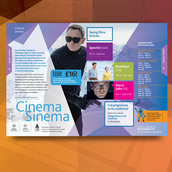
 One design element of this brochure that I could incorporate in my own work is having one photo from my photoshoot as the background so the audience get an idea of the genre and possibly the narrative of the film before seeing it.
 One design idea of this programme I could use is the brightly coloured text on top of a dark background to draw the audience's attention to it.
 From this brochure, I could use shapes as text boxes, particularly shapes with sharp edges or corners to make the brochure appear more attractive and unique.
 One of the design features I most like on this programme is the use of vertical text. I also like the fact that it has quite an understated colour scheme and that most of the colour comes from the photos. I think this essentially makes reading/understanding the programme easier for the audience.
 The design feature I like most on this brochure and that I could use in my own work is the overlapping images. They are also relatively low in opacity and I think using this combination in my own work would allow the audience to be given a lot of information about the film without being overwhelmed by content.
Planning and sketching
1) Create a spider diagram or bullet point list of all the things your target audience might be interested in. How can you use this information to create a main feature about your film that will appeal to your target audience?

2) Produce an A5 sketch of your front cover including the key conventions and design tricks you have studied in existing programmes and then planned in planning task 1 above.

3) Produce an A4 sketch of your double-page spread contents page. In terms of the text for your contents page, you will need to find out the names of the films of other groups in your class. The other films in the class will make up the rest of your contents page.

4) Create a spider diagram or bullet point list of ideas for your double-page spread feature. Write a list of potential headlines and sub-headings for the article you choose to go with.

5) Produce an A4 landscape sketch of your double page spread design now you have chosen the subject matter.

1) Which of your main characters will appear on the front cover of your programme?
Just the protagonist, Natalie.
2) What image or images do you need for the contents page?
A larger image from my film of the two main characters (Natalie and Moses) and possibly smaller images from the other productions.
3) What image or images will you use for the double-page spread?
Several images from my production's photoshoot - one of all four characters, one of the two main characters and two of the protagonist on her own.
4) Write a shot list for the photoshoot. Make sure you plan a variety of camera shots you will look to capture - medium shots, close-ups etc.
-Medium shot - Sophie and Daniel with backs to each other
-Medium long shot - all four main characters standing next to each other.
-Medium-close up shots - Sophie's face + various facial expressions.
-Medium-close ups - remaining three actors with eyes open/shut.
5) What costume, props or make-up will you require for the photoshoot?
No props are needed but the costume will need to be quite casual clothing accompanied by very subtle makeup, given that the the protagonist starts the film coming out of a modern-day hospital after enduring a traffic accident and multiple days in a coma.
Key conventions of a magazine cover:
-Title of publication
-Slogan
-Central image
-'Flash'/Cover Line/Sell Line
-Free offer
-Colour scheme
-Name Checks
-Language
-Competitions
-Direct Address & Asking Questions
-Bar code, Date and Price
-The 'Real' Target Audience
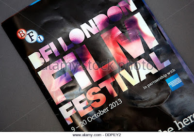
It's clear from looking at this programme cover that not all
12 key conventions of a magazine cover feature on it but the ones I can see
are: Title of publication, central image, colour scheme, name checks, concise
language and its date of issue. I think this cover differs from a traditional
magazine cover in that there's not much information as to its contents like a
traditional magazine e.g. 'Empire' would. I think the intentions behind this
were to draw the buyer's attention to one thing only - in this case the vibrant
title/central image on a black background. To make this visually interesting,
the designers have merged the title and the central image together to make one
image instead of having them separately and I think it's this that makes it
stand out against other magazine covers and intrigue consumers. In terms of the
colour scheme, the most prominent colours (apart from black) are red and purple
which are both - especially red - quite eye-catching colours and the fact that
they appear on the cover in quite a random, abstract way makes it all the more
fascinating because most magazines have relatively well structured covers so
once this (apparently) disorganised distribution of colour has got the consumer
interested they are likely to study it more, only to discover that the colours
aren't just randomly distributed; they in fact make up a person's face - the
cover's central image. Then, after becoming interested by the cover, they'll
undoubtedly notice the lack of information about the magazine's content which
will force them to open it and read what's inside.
3) Find at least 5 arts centre or cinema programmes/brochures aimed at a similar target audience to your project (arthouse cinema). For each one, pick out one design idea that you could use in your own print work.
One design element of this brochure that I could incorporate in my own work is having one photo from my photoshoot as the background so the audience get an idea of the genre and possibly the narrative of the film before seeing it.One of the design features I most like on this programme is the use of vertical text. I also like the fact that it has quite an understated colour scheme and that most of the colour comes from the photos. I think this essentially makes reading/understanding the programme easier for the audience. The design feature I like most on this brochure and that I could use in my own work is the overlapping images. They are also relatively low in opacity and I think using this combination in my own work would allow the audience to be given a lot of information about the film without being overwhelmed by content.Planning and sketching
1) Create a spider diagram or bullet point list of all the things your target audience might be interested in. How can you use this information to create a main feature about your film that will appeal to your target audience?

2) Produce an A5 sketch of your front cover including the key conventions and design tricks you have studied in existing programmes and then planned in planning task 1 above.

3) Produce an A4 sketch of your double-page spread contents page. In terms of the text for your contents page, you will need to find out the names of the films of other groups in your class. The other films in the class will make up the rest of your contents page.

4) Create a spider diagram or bullet point list of ideas for your double-page spread feature. Write a list of potential headlines and sub-headings for the article you choose to go with.

5) Produce an A4 landscape sketch of your double page spread design now you have chosen the subject matter.

Photoshoot
1) Which of your main characters will appear on the front cover of your programme?
Just the protagonist, Natalie.
2) What image or images do you need for the contents page?
A larger image from my film of the two main characters (Natalie and Moses) and possibly smaller images from the other productions.
3) What image or images will you use for the double-page spread?
Several images from my production's photoshoot - one of all four characters, one of the two main characters and two of the protagonist on her own.
4) Write a shot list for the photoshoot. Make sure you plan a variety of camera shots you will look to capture - medium shots, close-ups etc.
-Medium shot - Sophie and Daniel with backs to each other
-Medium long shot - all four main characters standing next to each other.
-Medium-close up shots - Sophie's face + various facial expressions.
-Medium-close ups - remaining three actors with eyes open/shut.
5) What costume, props or make-up will you require for the photoshoot?
No props are needed but the costume will need to be quite casual clothing accompanied by very subtle makeup, given that the the protagonist starts the film coming out of a modern-day hospital after enduring a traffic accident and multiple days in a coma.
No comments:
Post a Comment